Design
Style guide · Media and stand-up paddling
Supconnect
A refresh of the identity of the stand-up paddling publication we have run since 2007: a serif with authority, a deep blue from the water, and a yellow used only for accents.
- Partner
- Supconnect
- Sector
- Media and stand-up paddling
- Deliverable
- Style guide
- Scope
- 7 parts, from brand idea to video graphics
The idea
What the system has to do
Supconnect builds a community of paddlers who share travel, tips and recommendations, and it is the reference for gear reviews, tutorials, destination guides and news. The style guide gives that editorial role a consistent face across the site, social and video.
Dark blue carries the identity; white gives the photography room; yellow adds a little spice and is reserved for accents. The video graphics system turns every review into a recognisable Supconnect piece.
Palette
- Dark blue#1C345E
- Yellow#EDAF48
- Off-white#F7F7F7
- White#FFFFFF
Typefaces
- DM Serif TextHeadings
- Golos TextBody
In the book
What we delivered
- Brand idea
- Logo and misuse
- Typography
- Palette and colour usage
- Photography and videography direction
- YouTube video covers
- Video graphics
Spreads from the book
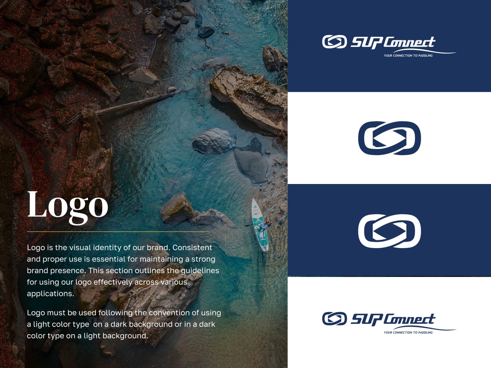
Supconnect logo on light and dark grounds 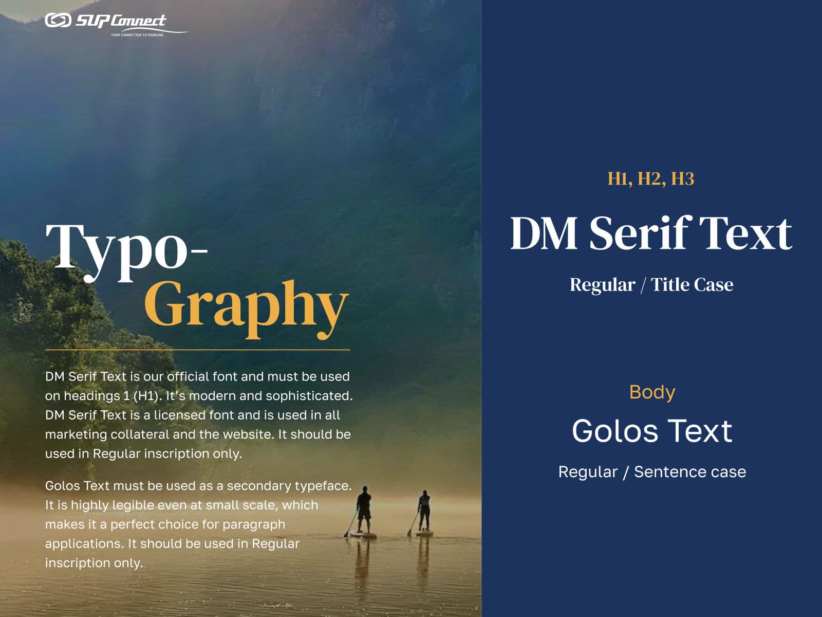
Supconnect typography, DM Serif Text and Golos Text 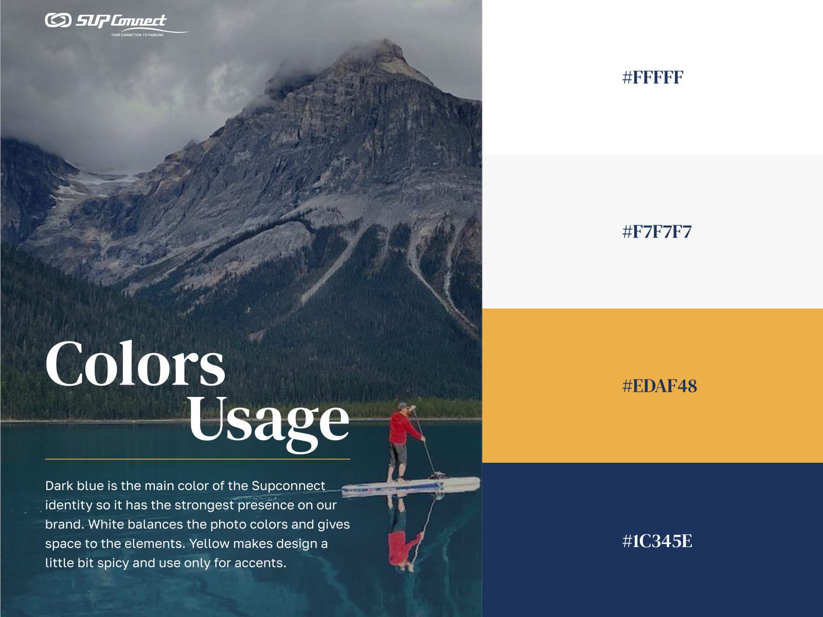
Supconnect colour usage 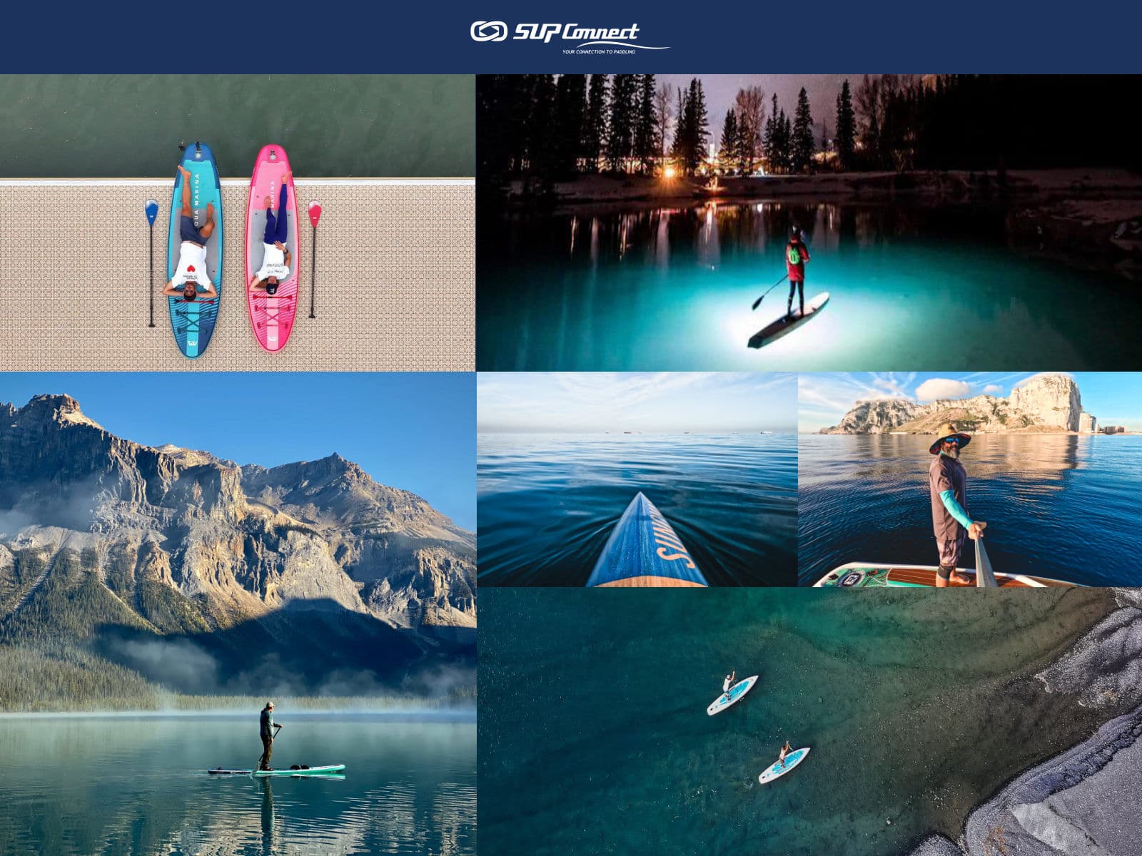
Supconnect photography direction 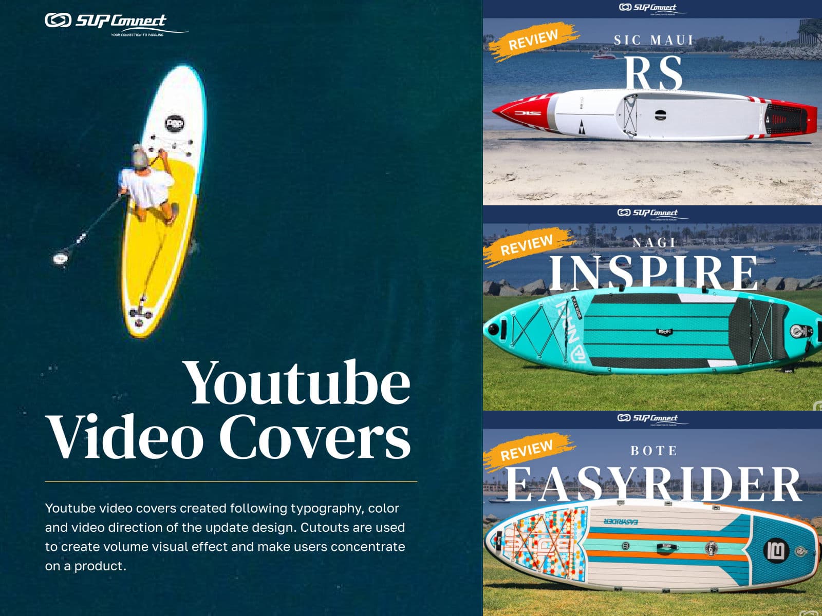
Supconnect YouTube video covers for board reviews 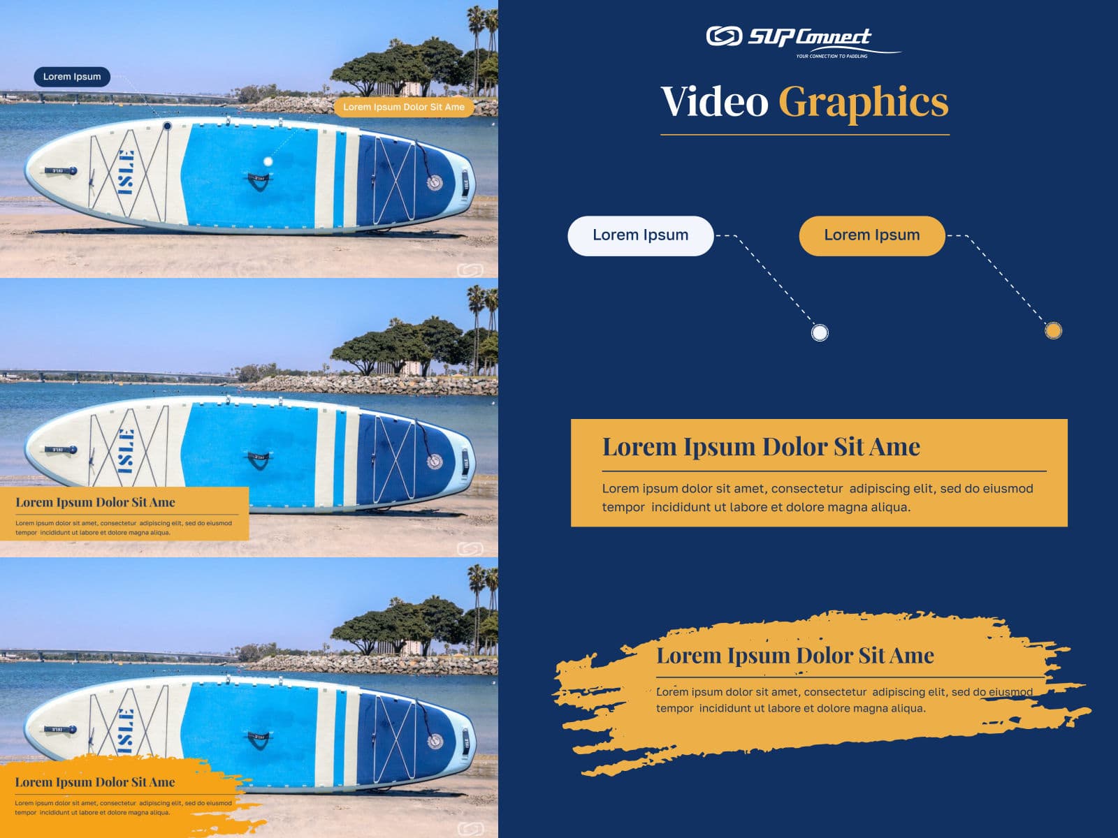
Supconnect video graphics