Design
Style guide · Agriculture
Avocado Growers of California
A mark that pairs California sunshine and palms with the avocado itself, and a system that carries it from the website to the fruit bag.
- Partner
- Avocado Growers of California
- Sector
- Agriculture
- Deliverable
- Style guide
- Scope
- 9 parts, from logo and usage to merchandise
The idea
What the system has to do
The logo makes the sun part of the avocado: a sunrise, with everything it suggests of something new, fresh and bright, set over palms that place it unmistakably in California.
Because growers put the brand on packaging, stickers and merchandise as much as on screens, the guide shows each part of the mark working on its own: the avocado shape, the sunburst, the palms and the type.
Palette
- Grove green#00843D
- Sun yellow#FFBF1B
- Red#BA0C2F
- Seed brown#5C462B
- White#FFFFFF
Typefaces
- California GothicLogo
- Brush Script MTLogo subtitle
- OswaldHeadings and body
In the book
What we delivered
- Logo and usage
- Colour
- Typography
- Photography
- Website
- Newsletter
- Stickers
- Avocado packaging
- Merchandise
Spreads from the book
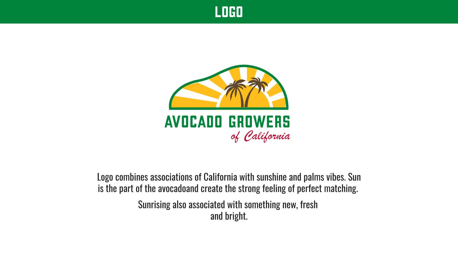
Avocado Growers of California logo with sunburst and palms 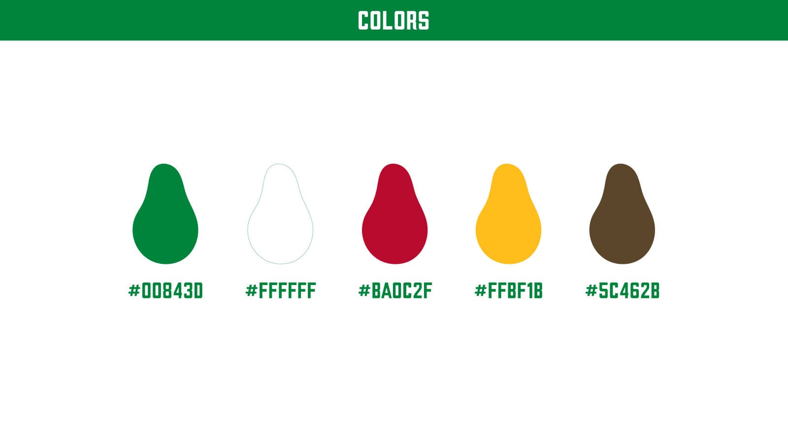
Avocado Growers of California colour palette 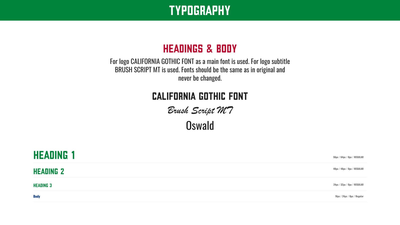
Avocado Growers of California typography 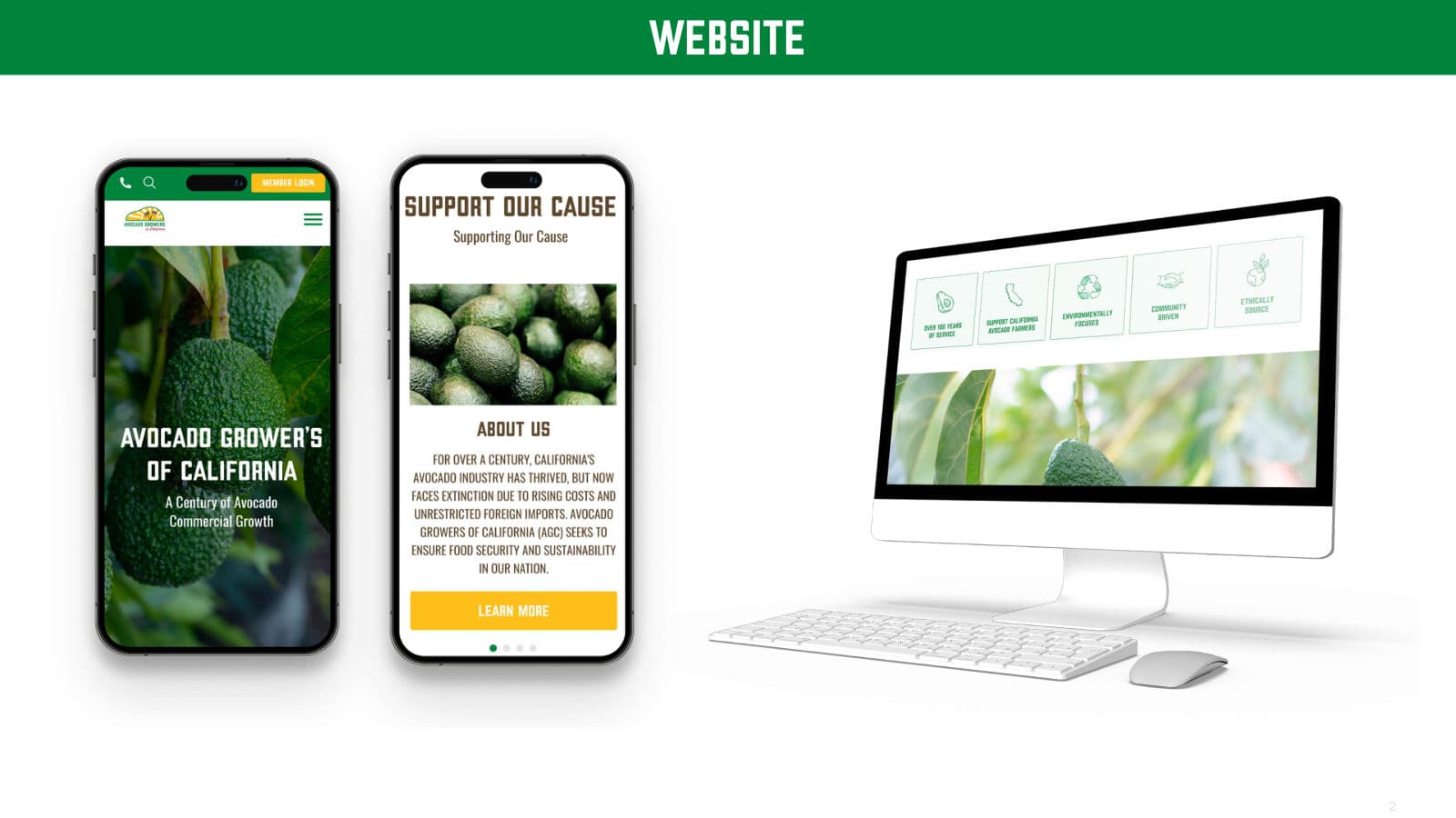
Avocado Growers of California website on mobile and desktop 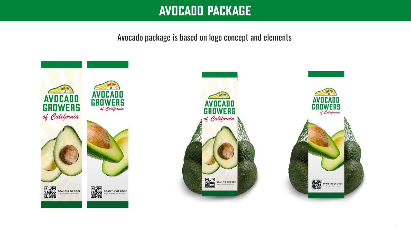
Avocado Growers of California avocado packaging 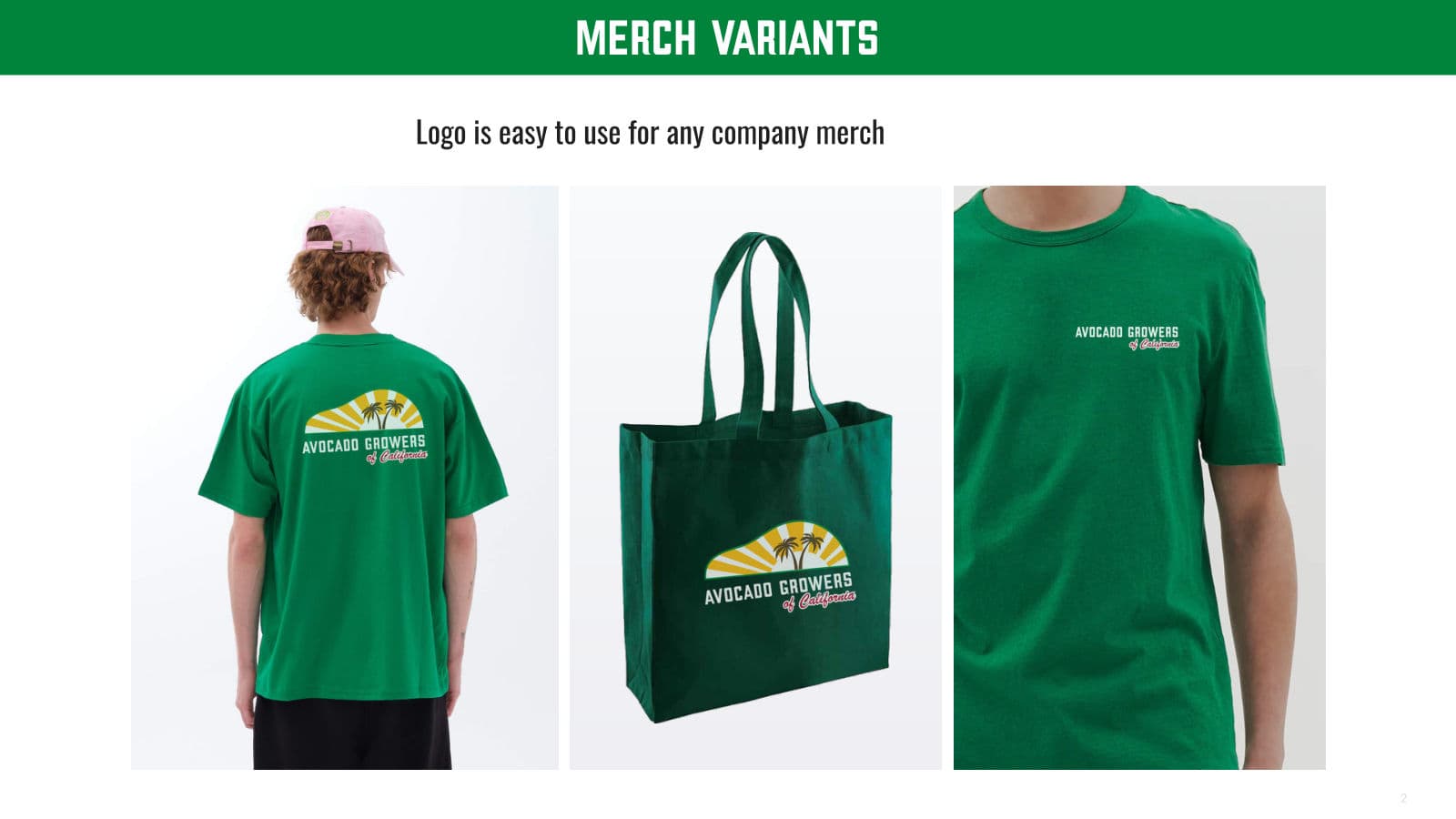
Avocado Growers of California merchandise
 Next in designTroopathon
Building or rebuilding a brand?
Start a partnership