Proposal · Culture and travel
Balboa Park
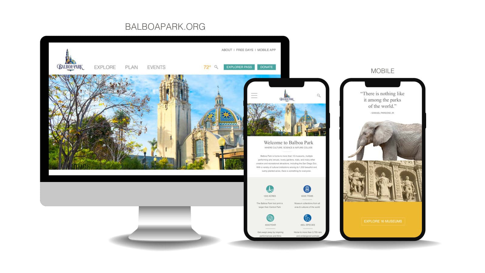
Our response to the BalboaPark.org redesign RFP started with the brand, not the website: keep the historic logo, add a modern typeface beside it, and widen the palette with warm grays drawn from the museums.
- Partner
- Balboa Park
- Sector
- Culture and travel
- Deliverable
- Proposal, in response to an RFP
- Scope
- 6 parts, from brand enhancement to instagram stories
The idea
What the system has to do
Balboa Park is home to more than 16 museums, performing arts venues, gardens and the San Diego Zoo across 1,200 acres. Before redesigning its website we asked what the brand already had, and what a fresh, modern online experience would need.
We recommended keeping the ornate logo as it is, pairing Times New Roman for tradition with Helvetica for clarity, and adding brighter colours and warm grays to the logo’s blues and yellows. The proposal then showed the idea at work: a responsive site, an aerial 360 video concept, a newsletter and a #MyBalboaPark social campaign inviting visitors to share what the park means to them.
Palette
- Park blue#015FA5
- Sky blue#679FC9
- Teal#45A39F
- Orange#FC9F15
- Gold#EDB92F
- Stone#595652
- Warm gray#A29E97
- Limestone#F2F1EE
Typefaces
- Times New RomanHeadings
- HelveticaBody
In the book
What we delivered
- Brand enhancement
- Website, desktop and mobile
- Aerial 360 video concept
- Email newsletter and pop-up
- #MyBalboaPark social campaign
- Instagram stories
Spreads from the book
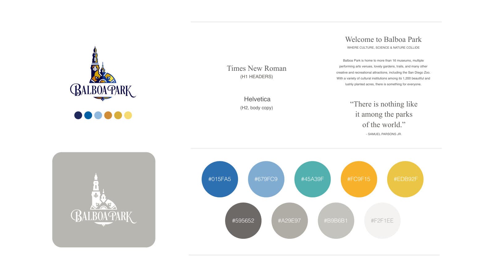
Balboa Park brand enhancement: logo, palette and typefaces 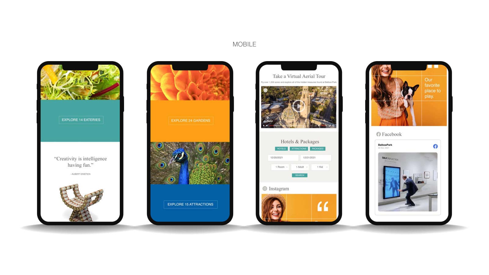
Proposed BalboaPark.org mobile pages 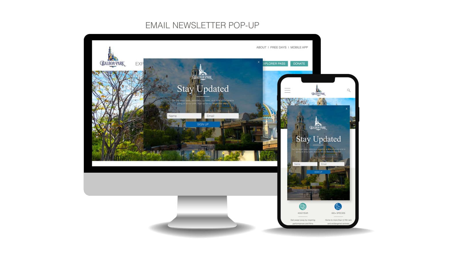
Proposed email newsletter pop-up 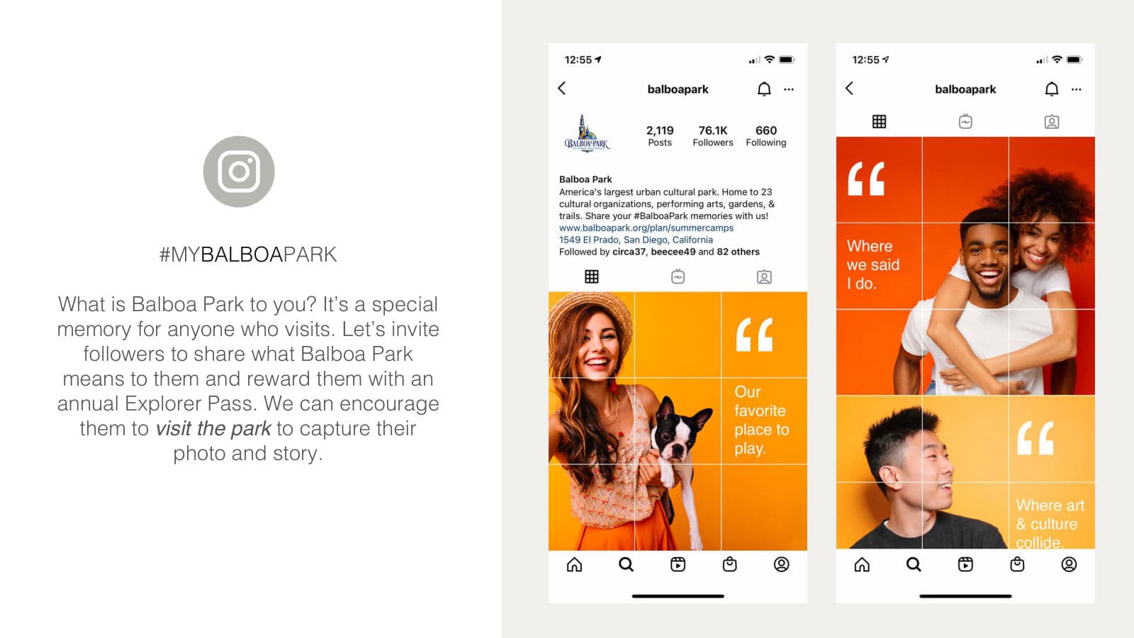
#MyBalboaPark Instagram campaign 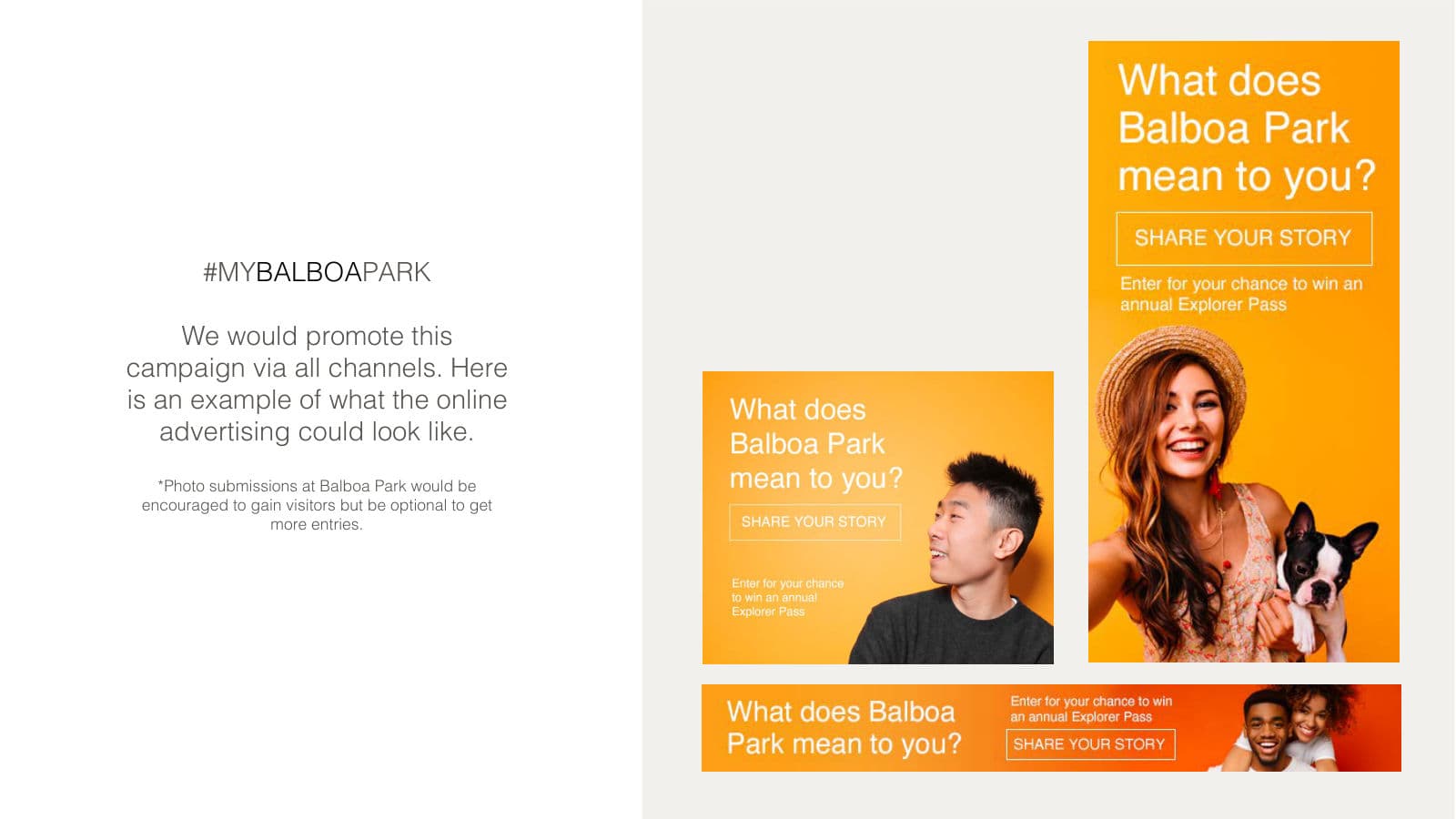
#MyBalboaPark social advertising
 Next in designSkimlite
Building or rebuilding a brand?
Start a partnership